Components
Component contributions can take several forms. Most are either component enhancements or brand new assets.
First steps to contributing
To contribute a component to Carbon, start by opening a Github issue. Include a detailed description in which you:
- Explain the rationale
- Detail the intended behavior
- Clarify whether it’s a variation of an existing component, or a new asset
- Include mockups of any fidelity (optional)
- Include any inspirations from other products (optional)
This issue will be the staging ground for the contribution and an opportunity for the community to weigh in with any suggestions. We encourage you to surface work in progress. Someone in the community may be working on the same component and interested in collaborating with you.
Documentation templates
Our component usage documentation typically contains three parts: usage guidance, style guidance, and code guidance. Some components are more complex than others but you should cover each topic included in these templates.
Usage guidance for components with one type
Use this template for documenting components with only one type, that is, no variants. You can see this template in use for Accordion and Checkbox.
---title: [Component name]description: [Explains what the component is in one or two sentences.]tabs: ['Usage', 'Style', 'Code', 'Accessibility']---<PageDescription><!-- Explains what the component is in one or two sentences. -->
Usage guidance with multiple types
Use this template for documenting components that have multiple types or variants. You can see this template in use for Dropdown, Modal, and Notification.
---title: [Component name]description: [Explains what the component is in one or two sentences.]tabs: ['Usage', 'Style', 'Code', 'Accessibility']---<PageDescription><!-- Explains what the component is in one or two sentences. -->
Style guidance
We’re still working on this template. We’d love your help and feedback!
Help wanted!
Code guidance
This page helps developers implement your component. Be specific, include code snippets, and be sure to update as dependencies and versions change.
---title: [Component name (you won't need to write this)]description: [Component description (you won't need to write this)]tabs: ['Usage', 'Style', 'Code', 'Accessibility']---<PageDescription><!-- How to build a [component name] using React. For code usage with other
Parts of a component contribution
Component contributions ideally include all of the following parts.
1. A rationale
Explain how your component will add value to the system. Carbon serves the widest possible range of products, and contributions that increase the scope of the system are more likely to be accepted. Be sure to include any user experience and interaction descriptions.
2. A design spec
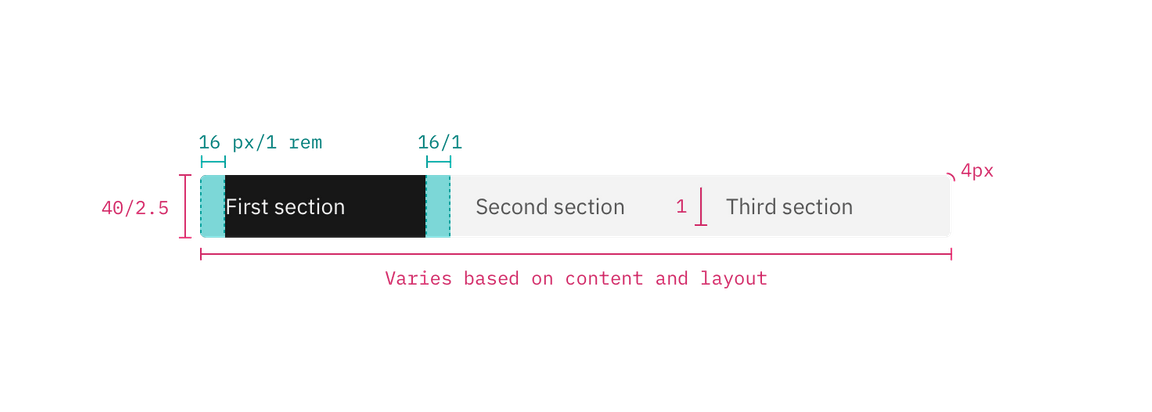
Create sizing and styling annotations for all aspects of the component. This spec should provide a developer with everything they need to create the design in code. Check out our production guidelines to get started.
You should include color tokens and type tokens used.

Example of a design spec
3. A Sketch symbol
Any new components or changes to existing components will also live in the Carbon Sketch kit and so we’ll need a Sketch symbol. Check out Sketch’s guide for creating a symbol.
This symbol can be contributed with the asset or enhancement, but must be added to the kit by one of its maintainers. To contribute a symbol, simply open an issue in the kit repo.
4. Usage documentation
For guidance, see our production guidelines and documentation templates above. Reading through existing component documentation on the site will help also. Color and type tokens will live in the style tab.
5. Working code
The component or enhancement must be built in one of our supported frameworks (Vanilla, React, Vue, or Angular). See the contribution guidelines for the specific repo you intend to contribute to.
6. Code documentation
Start with our Code guidance template. We recommend reading through existing code documentation on this site for inspiration.